
Original still life. I’m not feelin’ it.
Diving in to project 6, “Monochromatic Still Life Studies,” I wondered why anyone would want to approach painting with such limitation. As an artist who tends to throw a lot of color around, it seemed counterintuitive to me. On top of that, I sat in an area of the classroom where the still life set-up closest to me provided no inspiration whatsoever. Neither the color palette nor the objects sparked any creative desire at all. Additionally, no matter how I looked at it, the composition bored me. A pumpkin and a lemon on top of a wooden chair. Yay. As much as I tried to make it so, it just wasn’t exciting. How could I make something so drab into a painting with which I would feel remotely content?
I tried a number of thumbnail sketches until falling upon two compositions – one full scale and one cropped in close. For version one – the full scale composition – I selected Burnt Sienna (a warm brown tone) as my color. Halfway through, I got bored and “cheated” a bit by adding orange and yellow. It fell flat. I wasn’t sure why.
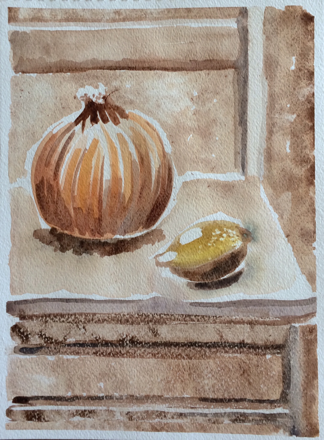
Version one. I cheated, adding some orange and yellow. It feels flat to me.
For version two – the cropped composition – I chose Alizarin Crimson (a cool red tone) as my color. This time I tried not to “cheat” and limited myself to varying tones of red, with gray, black and white mixed in. Okay, I might have cheated a bit, but nowhere near as much as the first version. It forced me to look more closely at tonal quality rather than color.
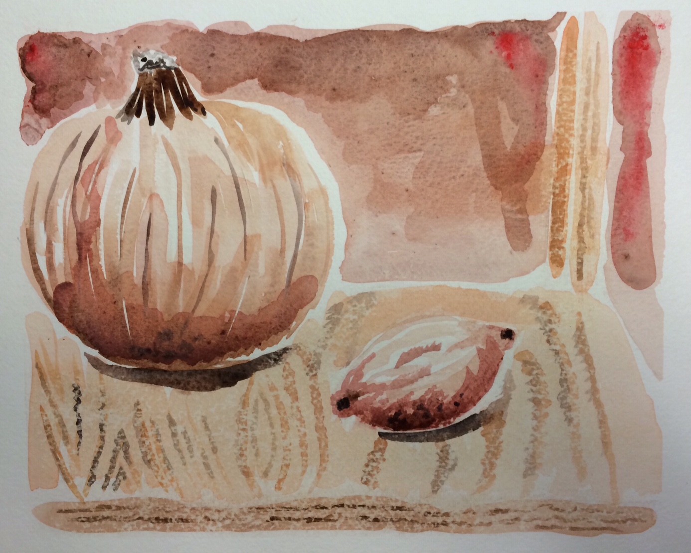
Version two. I tried to stick more to one color and focus on varying shades and tones.
This got me thinking, why do people like black and white photos? Years ago, it was the only medium available. So when color photography went mainstream, why did black and white photography continue to be popular, especially among professionals?
I recalled looking at an article recently where artists took old black and white photos and “brought them to life” with color as if they’d been taken yesterday. While fascinatingly true (it did change the quality of the photo significantly), something was lost. That something, I believe, was a complex story. A mood.
Some photographs only draw us in because of their stunning colors. Black and white pictures reflect an authentic beauty. It forces us to focus on the subject and the variation of values within that subject. Due to the absence of colors we are forced to evaluate the gray area. And isn’t that where life’s intrigue resides? With only the gray area before us, we long to know the real story behind the image.
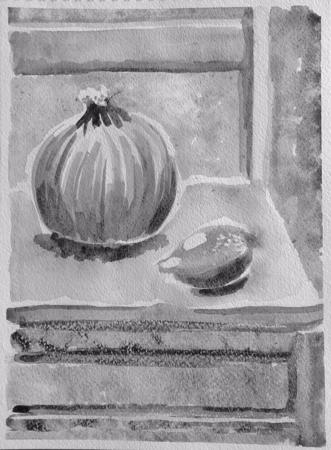
Okay, I know, that might be overly philosophical when talking about a pumpkin and a lemon on a wooden chair. So I decided to try a more scientific experiment and take black and white pictures of my paintings. Suddenly I knew why version two was more successful. I had captured the gray area. When turned black and white, the first version looked flat but the second one had depth.
Too flat. I didn’t capture the tonal qualities, focusing too much on color.

Better focus on tonal qualities. More emphasis on gray area leads to a more interesting piece.
Do I long to know the real story behind the pumpkin and the lemon? Not really, I admit. But what I do want to know more about is where the gray area lives.
“Light is meaningful only in relation to darkness, and truth presupposes error. It is these mingled opposites which people our life, which make it pungent, intoxicating. We only exist in terms of this conflict, in the zone where black and white clash. ” ~Louis Aragon


